UI Systems
Orbit Design System (Ongoing)
Summary
Warwick's digital estate spans thousands of pages built across teams that largely work in isolation, producing inconsistent experiences, duplicated effort, and brand drift that is visible to every user who moves between departments. Orbit is Warwick's design system: a shared library of reusable components, style guidelines, and documented patterns built to give every team the building blocks they need to create high-quality digital products, faster. As project lead, I defined the strategy, commissioned external design agency Mammoth to build out the Figma component library, and established the tooling and governance model to support long-term adoption.


Opportunity
The problem is structural. Teams across Warwick have historically built their own components and pages without cross-team coordination, meaning users encounter different designs, writing styles, and navigation patterns depending on where they are on the site. Two internal case studies, the Medical School and Economics department, illustrate the cost clearly: content being maintained twice, components built from scratch by well-intentioned people with no alignment to brand, and pages that fall out of date with no clear ownership.
Beyond inconsistency, the financial case is significant. Based on a study of design system adoption, teams can deliver work in 31% fewer hours with an 18% improvement in quality. Applied to Warwick's 3,000 editors at an average of five hours per month, the projected saving is approximately £948,600 per year, against a current design system spend.
3,000 editors. 31% fewer hours. A projected saving of £948,600 per year.

Design Strategy
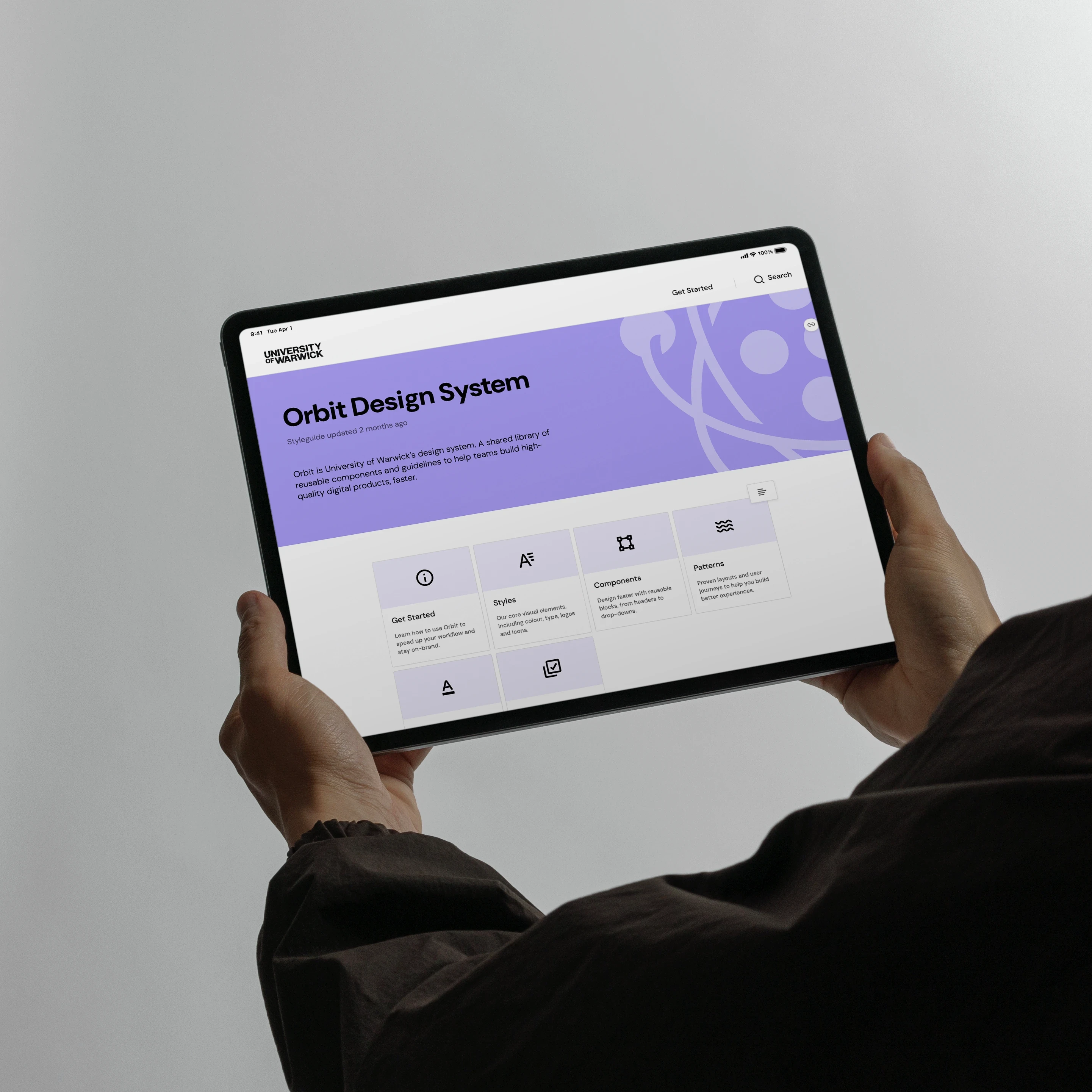
The strategy for Orbit is to encompass all digital touchpoints regardless of department or organisational structure, providing building blocks that support well-intentioned people rather than replacing their autonomy. The system comprises three layers: a style guide that specifies visual and interaction standards, a component library of standardised reusable elements maintained in Figma and mirrored in code, and a pattern library that assembles those components into page-level templates. Accessibility best practices are baked in at component level, preventing editors from introducing issues by default rather than relying on individual knowledge. The system is hosted on Zeroheight as the single source of truth, pulling live from Figma and Storybook.

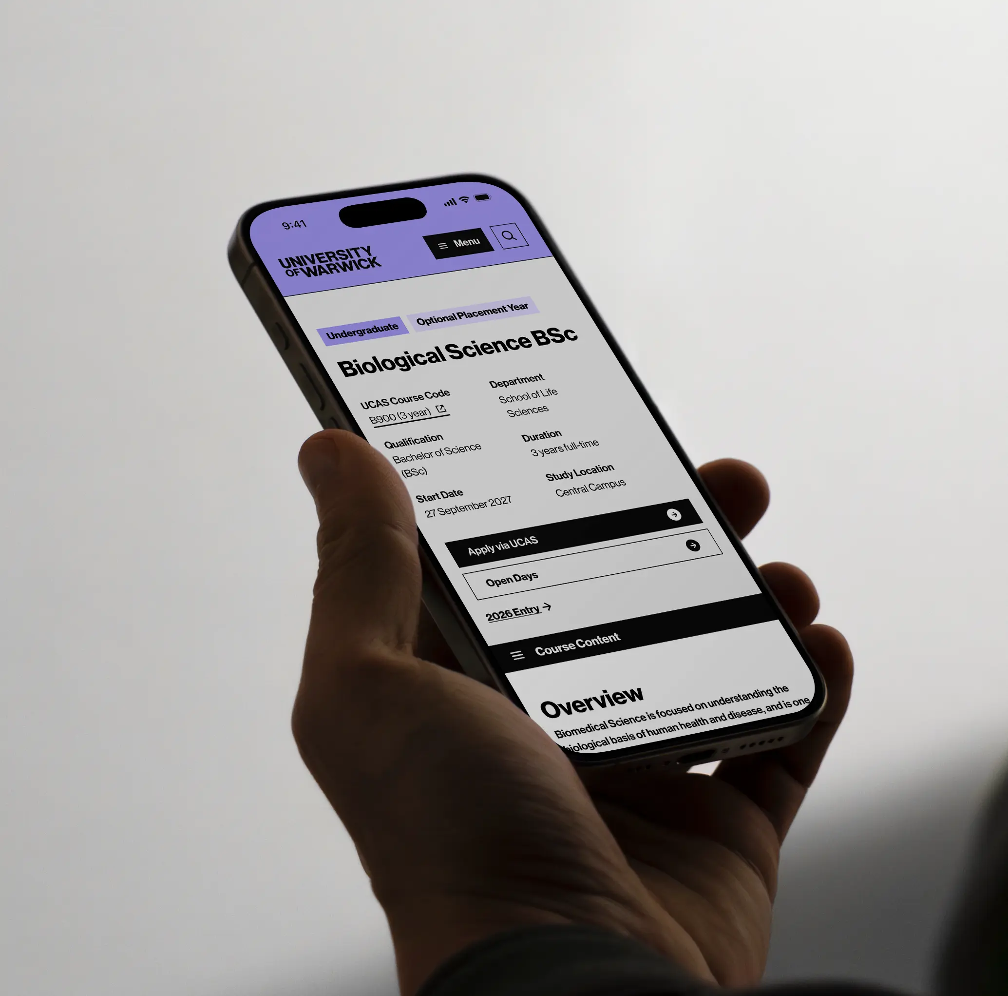
The rollout follows a phased approach. The Alpha design system is a focused component set built specifically to support the UG27 course page launch, covering the brand elements that appear across every page of the undergraduate journey. The Micro design system follows as the first 20 components released site-wide on Sitebuilder, creating a consistent foundation that bridges across to the incoming DXP platform as both run simultaneously.


What's Next
The immediate focus is completing the Micro design system and formally launching Zeroheight as the documented home for Orbit. Beyond that, the roadmap expands the component library progressively, with sprints structured around Monday kick-offs and Friday delivery. The longer-term ambition is system-wide unification: a single consistent experience for users regardless of which part of Warwick's digital estate they are navigating, and a platform that gives editors the confidence to build new pages without guesswork.


Team
Kyle Palmer — Design System Lead
Mammoth — Supporting Design Agency
Remarkable — Developers